AT&T Digital Design System
Challenge
I was part of the core leadership team responsible for creating an entirely new design system for AT&T’s online web properties. This would be the first time that the B2C and B2B teams would have access to the same design elements in order to begin to standardize the look and feel of the many, many pages within the AT&T sites and apps.
When we began the project, there were over 50 separate online properties, each with their own design. It was exciting to be part of the team responsible for creating one set of buttons (and nearly 100 other design elements) to be used across all of AT&T.
Another project goal included having a site for Users to learn about the initiative, view and learn about each and every design element, and view and copy or hook up to a common code base for the design elements.
Approach
I was responsible for structuring and designing the entire site that would house all of the new design elements. I used Axure to create the Wireframe / clickable prototype.
I created and analyzed a User survey early on in the project in order to tease out critical design factors from our User community.
I was also responsible for creating the taxonomy of all of the design elements. For this body of work, I created 2 card sort activities in order to allow our Users to provide input into the most logical grouping of elements.
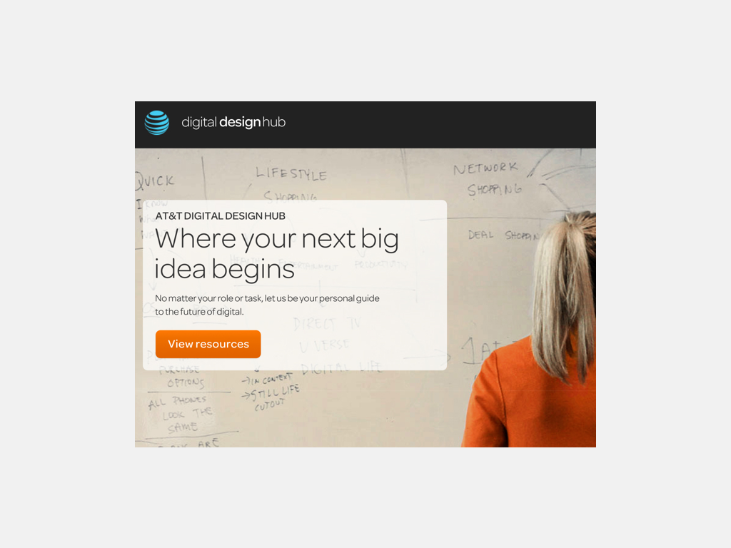
Here is the Home page Comp that was produced by the Visual Designer:
Wireframes / Prototype that I created
Mobile version of the home page
Example of a Design Pattern Detail Page
(image taken from my Axure prototype)
I was also able to assist with a few of the design elements themselves. I assisted with quite a few elements in order to provide interaction guidelines and edge cases for a few trickier elements.
Here is a redline that I created for the Step Indicator design element:
Results from the card sort
Result
Having one set of design patterns and design standards for every design team and development team at a large organization was a huge effort. We worked closely with various design and development teams in order to ensure we were on the right track. We invited all designers to a ‘come and break it’ session where we gave them pages to try to mock up with our new design elements and received feedback about what worked and what didn’t.
It was a lot of fun to be part of such an important project and I was honored to be part of such a fantastic team of collaborators.
Project Details:
Company: AT&T
Year: 2015
Team Size: 8
My Role: UX Designer
My Contributions: Taxonomy, Prototyping, some design pattern specification, some redlining.
Project Goal: Define styles and standards for over 50 separate properties. Replace 17 style guides with 1.


