Report Design and User Research
Challenge
A report suite in PowerBI previously contained information-only reports.
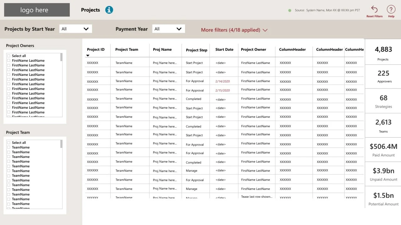
View of the main table-based report.
There was a request to add some visual report pages in order for Users to be able to visualize the information contained in the report suite.
The hope was that these visuals would also help with balancing workload across team members and understanding busy times of the year.
Approach
The project team had previously completed some discovery efforts and some technical feasibility explorations before I joined the project.
I analyzed the information being requested, the technical feasibility outputs, and a few visual reports already in use across the organization (and built on an old platform).
Early wireframe draft showing the placeholder PBI icon set.
I created some design alternatives in Figma and selected a set of already created PowerBI icons as placeholder icons.
After reviewing with the project team, our developer team created versions of the report visuals directly in PowerBI so that Users could work with a live tool and be able to filter real looking data.
I then created a user research testing script to have actual Users look at these new report visuals.
We set up the user research sessions and I conducted each one. The duration was 45-60 minutes each. We met with 8 participants and ran through 7 different questions for each of the 4 new report visuals.
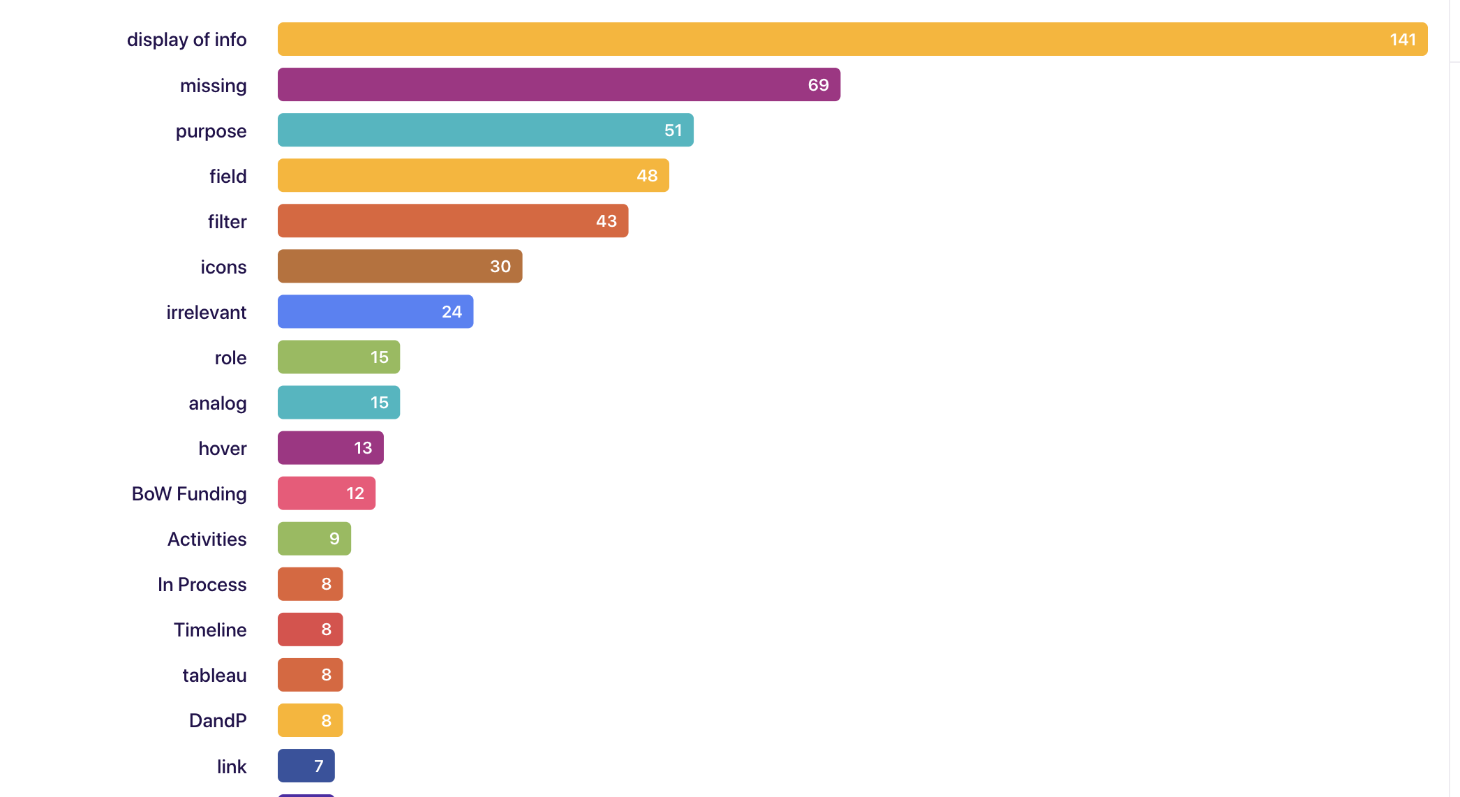
Sample of the user research testing findings for one question for one report visual:
The icons we chose to go with in the short term were the ones we could get 'for free' from PBI. As predicted, they received mixed reactions. Most participants noticed them and/or commented on them (6 of 8 participants). 1 of 8 seemed to really like them. 1 of 8 seemed to really not. And 4 of 8 seemed lukewarm about them. A selection of quotes:
"I really liked the like progress that you can see out of the four boxes."
"the key on the bottom left is super clear"
"it's [icon] also sharing is if there's a contingent payment that's attached to that deliverable"
"I really like that there's contingent payment"
"Maybe it's blue because it's a payment contingent"
"It's not easy. I couldn't even tell that they were different kinds."
"[the icons are] very, very small"
"some of our [redacted user type] do really like just the colors of like Tableau and green means like good job, you've completed your payment."
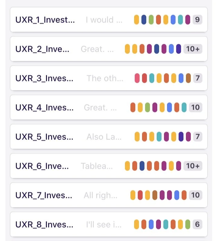
Tags applied to each participant session in DoveTail.
Tools I used:
Microsoft Teams to record the meetings.
Microsoft Stream to export the recorded meeting videos.
Dovetail to import the videos and transcribe the sessions.
Dovetail to tag the videos with placeholder tags for each participant and each report visual tested.
Microsoft Excel to keep track of tagging progress and also to capture the verbatim responses when a particularly useful quote was uttered.
Microsoft PowerPoint to put together findings and present the findings to the project team.
Figma to take our learnings back into the design phase and incorporate the learnings into the next set of designs.
Figma to create the custom icons used for one report visual.
Distribution of tags applied in DoveTail.
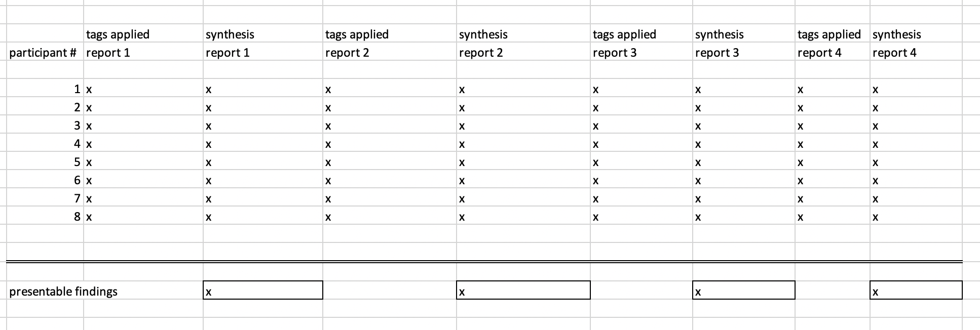
I used Microsoft Excel to help me keep track of which participant interviews and which reports had been tagged and analyzed.
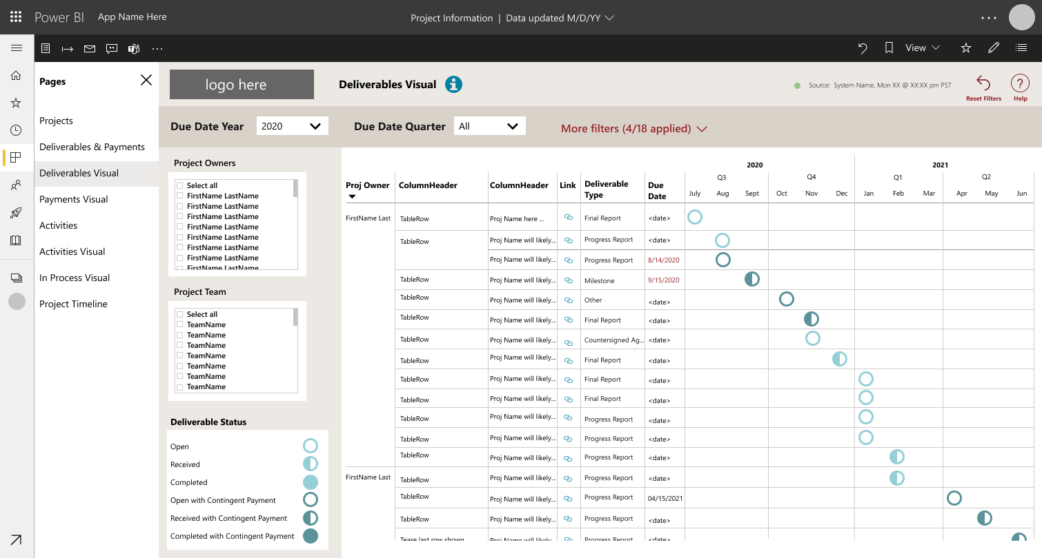
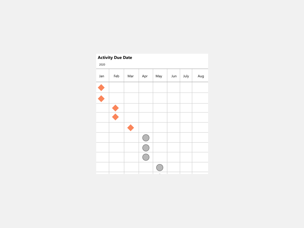
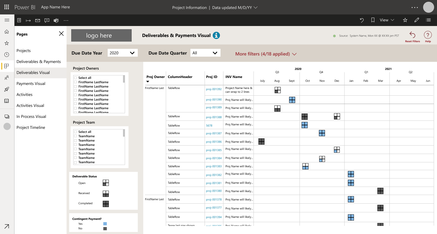
Report Mockup #1 - Deliverables
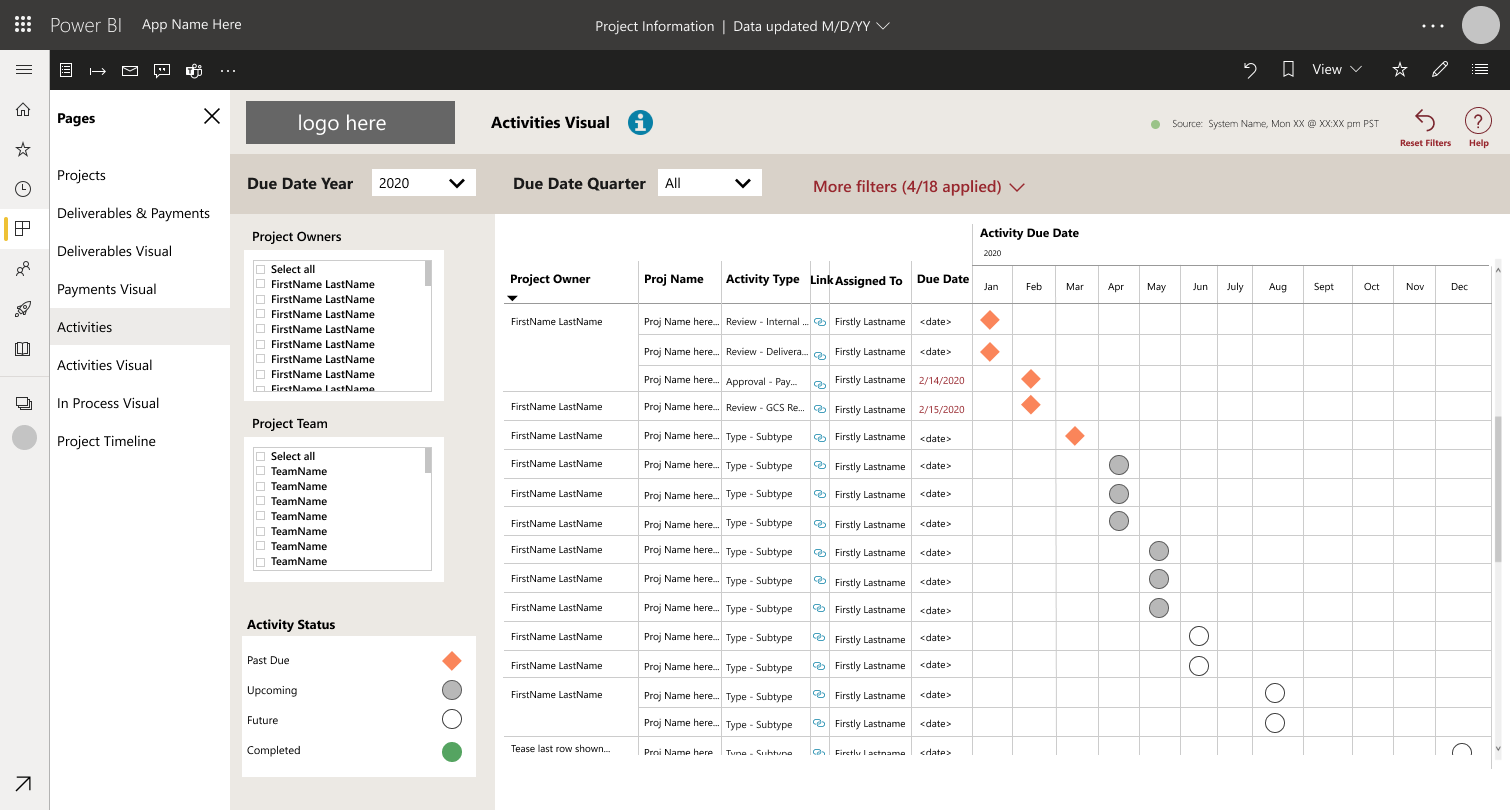
Report Mockup #2 - Activities
Result
This project was really fun to work on. I love trying to find the best of what’s possible given the technical limitations of a program like PowerBI. I love learning how Users want to ‘see’ their data. I love creating a rapport with Users during the User testing sessions. I love being able to analyze the data - in this case: the data about the data. I love being able to collaborate with developers on the right design options to put forward after we learn what we needed from the Users.
We were able to launch these 4 new report visuals to the Users and feel confident that we are giving them the tools they need to do their jobs…since we were able to test the early designs with actual Users and edit the designs with real feedback.
Project Details:
Company: <Private>
Year: 2020
Team Size: 4
My Role: UX Designer
My Contributions: Taxonomy, Wireframing, Design, User Research
Project Goal: Create visual report pages to accompany the table-based reports