Lesson Page Design
Challenge
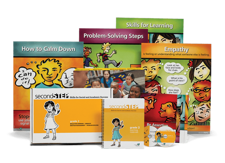
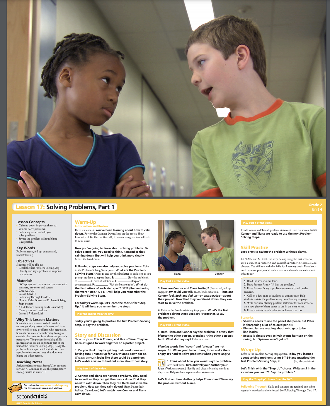
Committee for Children has been producing Social Emotional Learning curriculum for decades. The Second Step Program offers physical lesson kits for in person instruction of Social Emotional Learning for Elementary grades. The teacher holds up a picture to the class. Facing the teacher is the script for that week’s lesson.
Image of the entire physical kit for Grade 2.
Sample physical lesson card for Grade 2.
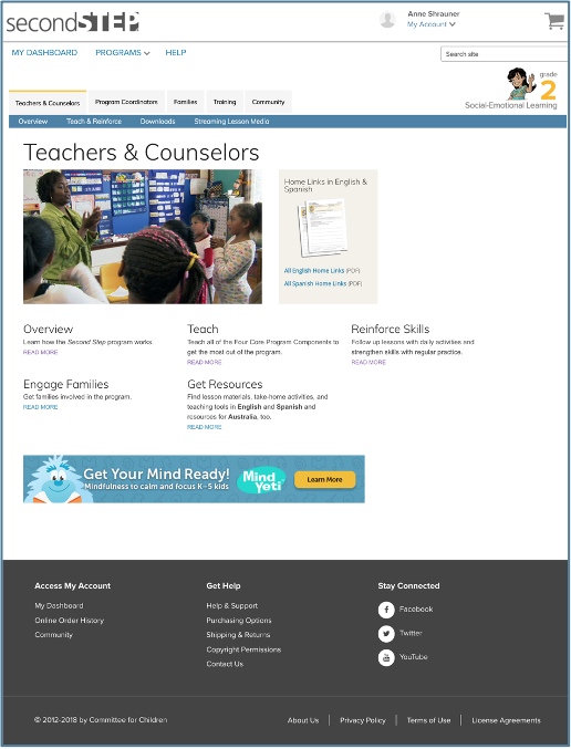
Online resources are available on the Second Step site in order to teach, support, and reinforce the lesson, but the organization of the material available to teachers was only organized by type of material.
Before: Previous view of the Teach & Reinforce Landing page for Grade 2.
It was difficult to find the item the User needed.
For example, if a teacher wanted to prepare for lesson 6, they would have to go to one page to grab the media for lesson 6 and another page to grab the following through card for lesson 6 and another page to grab the student handout for lesson 6 and another page to access the home letter and another page to get to the daily practice activity for lesson 6. And so on.
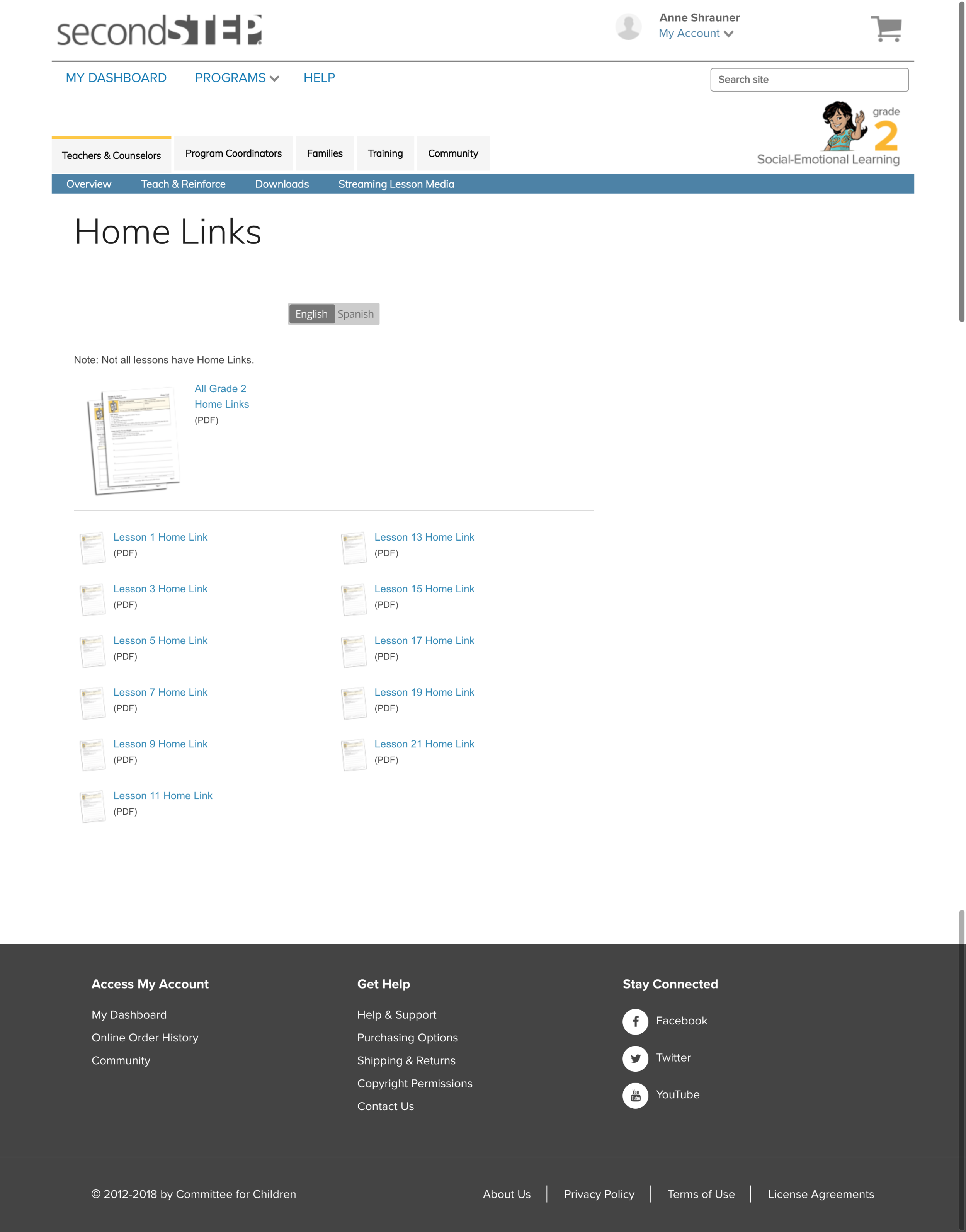
Before: List of Home Links for Grade 2.
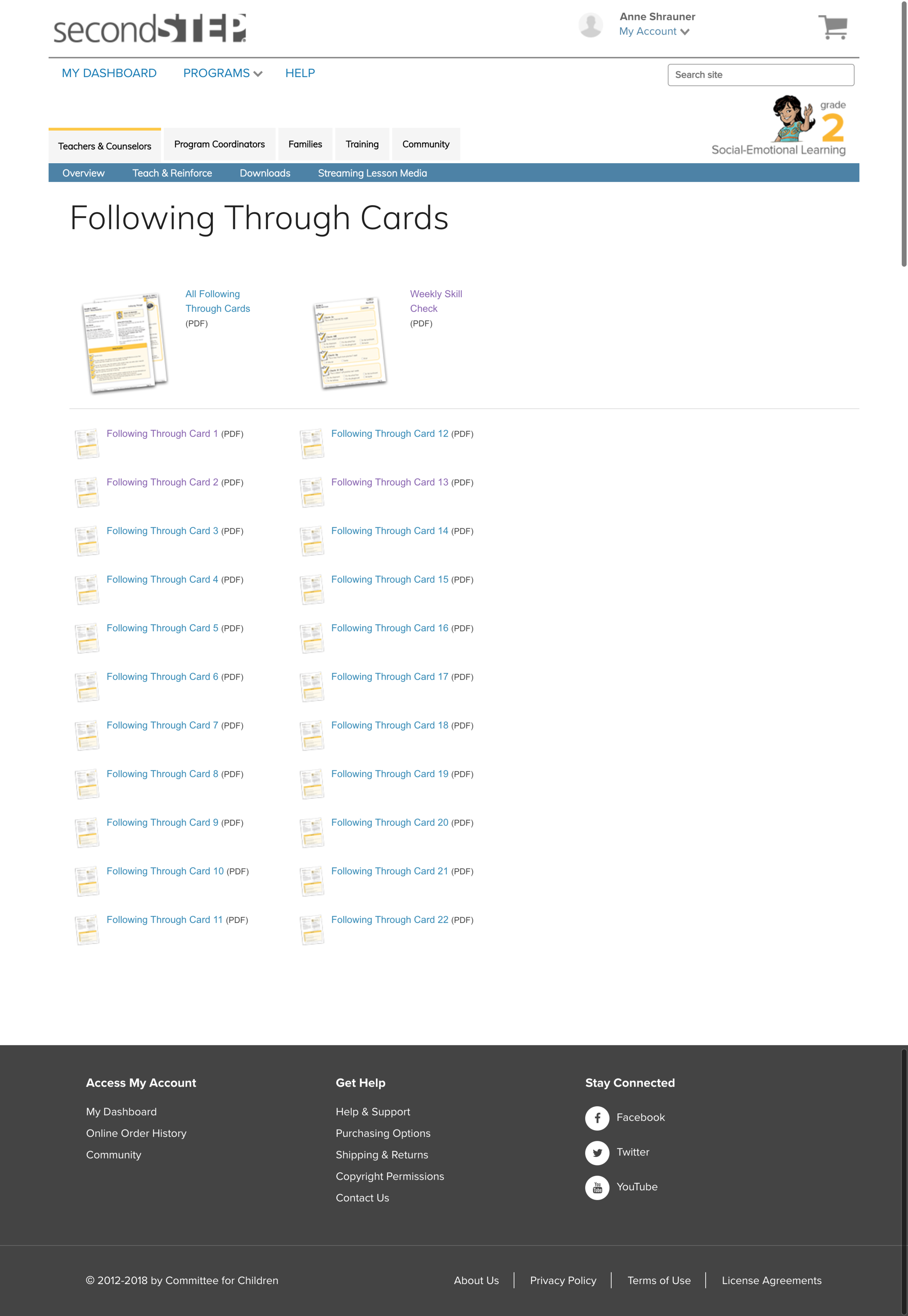
Before: List of Following Through Cards for Grade 2.
In addition, it was hard to locate the various artifacts as some important content was missing from the main parts of each menu.
The challenge was then how best to create a single page that would contain all of the materials for lesson 6.
Approach
I studied the site and the physical kits used to teach the lessons. I talked often with the content manager and the content creators to understand the current structure and design of the lessons.
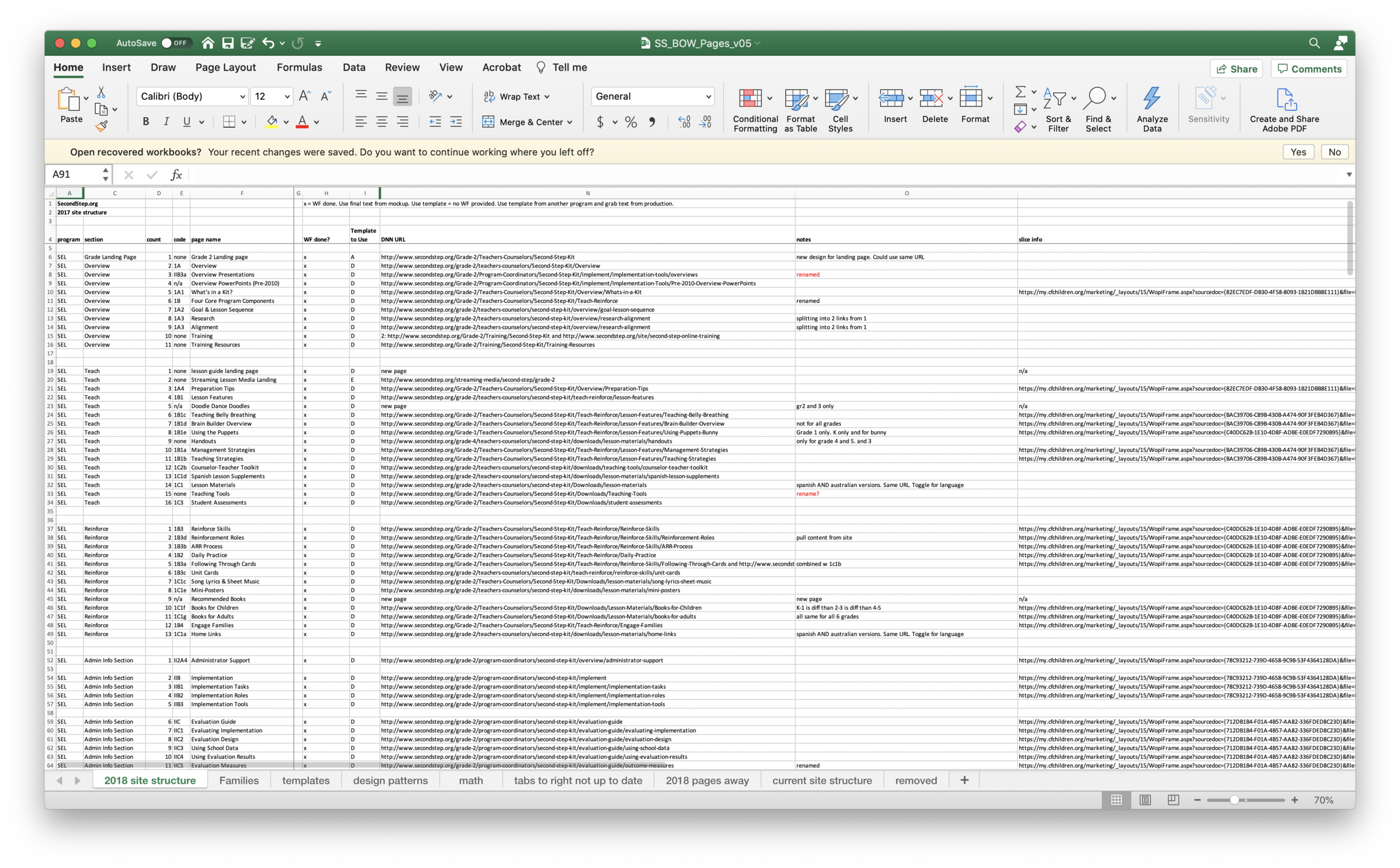
Draft of the content inventory for the new information architecture.
I studied previously created content inventories and created a new content inventory.
I started out with a few design layout options for how to both layout the site pages and how to architect the entire site itself. After a few rounds of updates and review cycles with the project team, we had a good set of pages and sections.
Early and very rough draft of initial page design and layout.
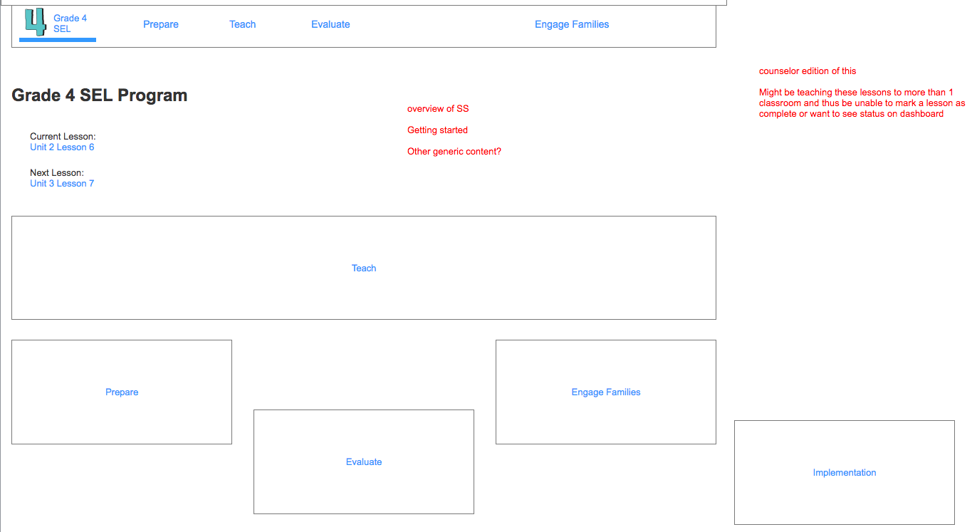
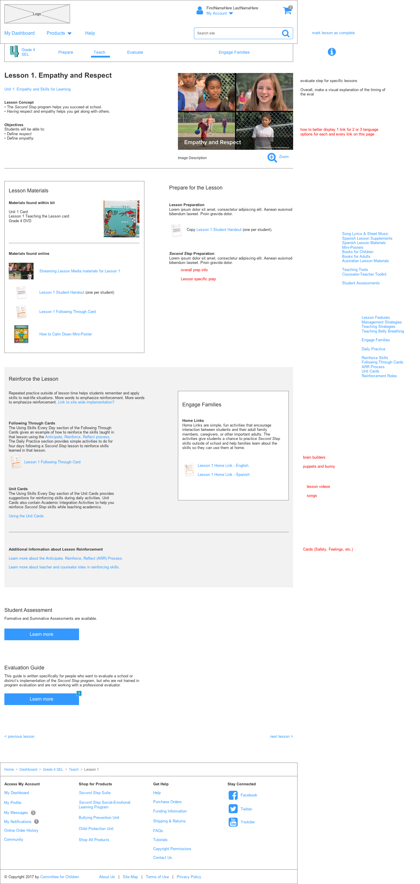
A later version of a draft wireframe for a Lesson page.
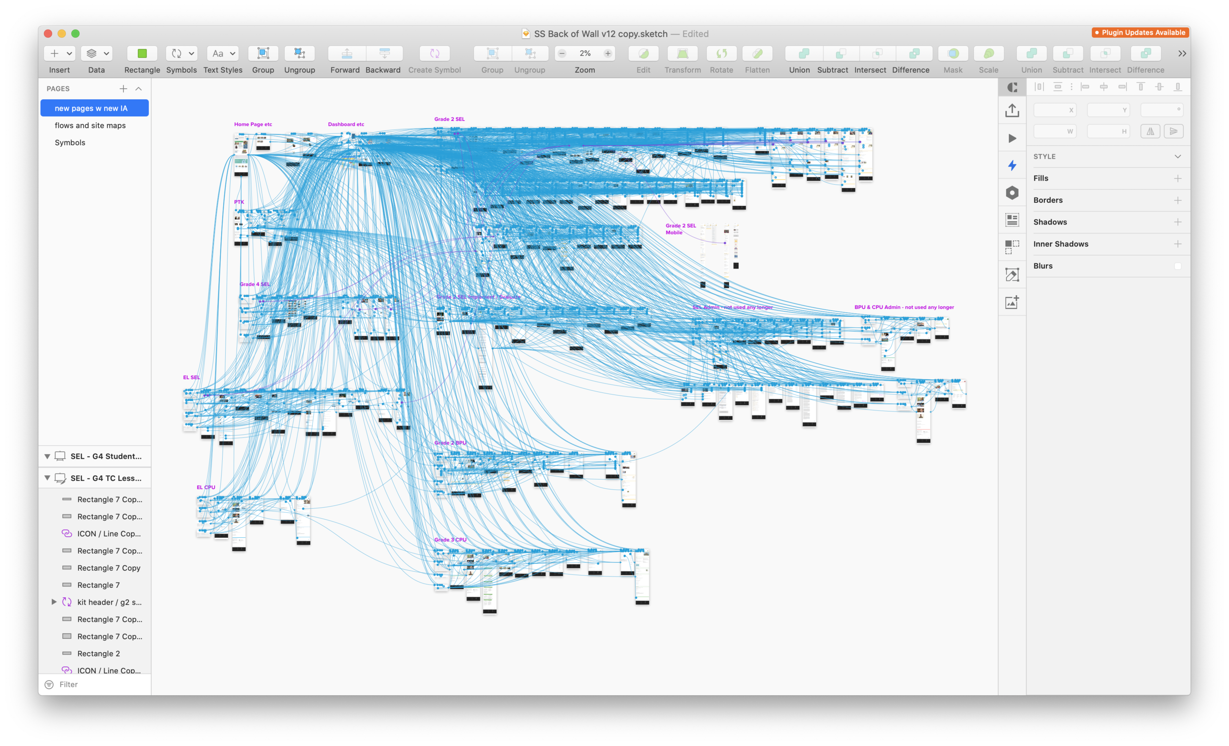
Sketch file for the draft of the new site layout.
I then created a Sketch file for mockups and used InVision for a clickable prototype to communicate the desired page flow and site layout.
In the end we had 153 pages and a wee bit of trickery involved in making the navigation ‘work’ in prototype fashion.
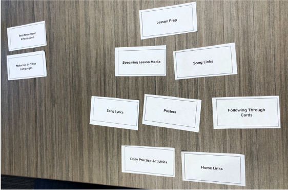
UXR Card sort activity.
The next step was to get these new designs in front of Users.
I created a user testing plan to test the design of the pages, the overall layout of the site, and the order of the information on the pages.
I conducted user testing sessions with actual teachers and counselors that use the Second Step curriculum in their physical classrooms.
I took each User through 7 different way-finding scenarios to test out the information architecture being proposed. I used a card sort activity as part of the user test to help inform the correct order for each Lesson page.
I conducted a read-out session to reveal the results to the project team.
We learned that overall the new layout of the site and the new lesson pages were well organized and well put together. One User has some initial trouble finding the link to a particular lesson page. Knowing that the visual design portion of the work would be coming in a future phase, we knew we would be able to solve that issue during the Comp creation.
Result
One of the biggest wins in this project was being able to reinforce how our education curriculum team wanted the lessons to be taught…and to be reinforced. That’s one piece of this project that lasted beyond my time on the project and after I left the organization.
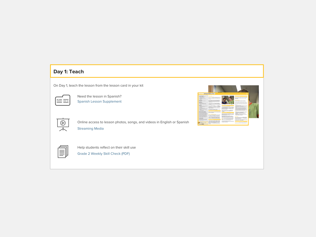
Mockup I created for the layout of the Lesson Page. This page was a big part of the UXR study of the proposed new site.
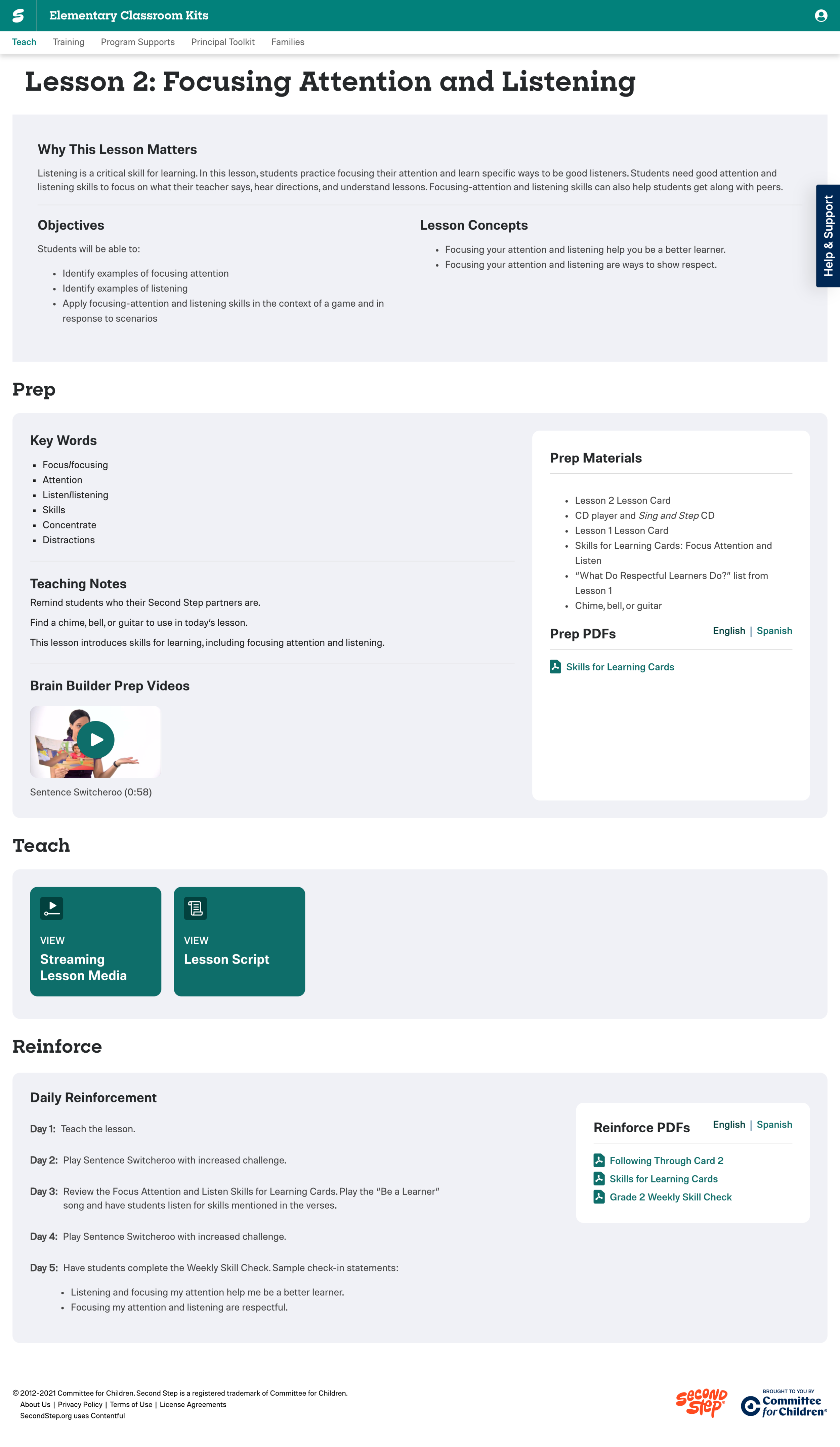
Eventual actual page that was created for the Grade 2 Lesson 2 Lesson Page.
It was a lot of fun to be part of such a big and involved project and I was honored to be part of such a fantastic team of people at Committee for Children.
Project Details:
Company: Committee for Children
Year: 2018
Team Size: 4
My Role: UX Designer
My Contributions: Taxonomy, Wireframing, Prototyping, User Research
Project Goal: Create a new page for each Lesson of SecondStep
