Eyeglass Site Redesign

America’s Best Eyeglasses and Contacts approached LiveAreaLabs (LAL) for a redesign of their current site.
I was the UX Designer on this project. The visual design team at LAL and I worked with the client to provide a new look and feel, complete with new site layouts, fonts, and colors, while retaining the feature prominence requested.
Challenges
The client wanted to retain a lot of their current functionality and site layout / feature prominence, especially with regards to positioning of how to find a store and schedule an exam.
Another ask of the site is that it should try to match up with the in-store experience of the well-established brick and mortar stores.
Approach
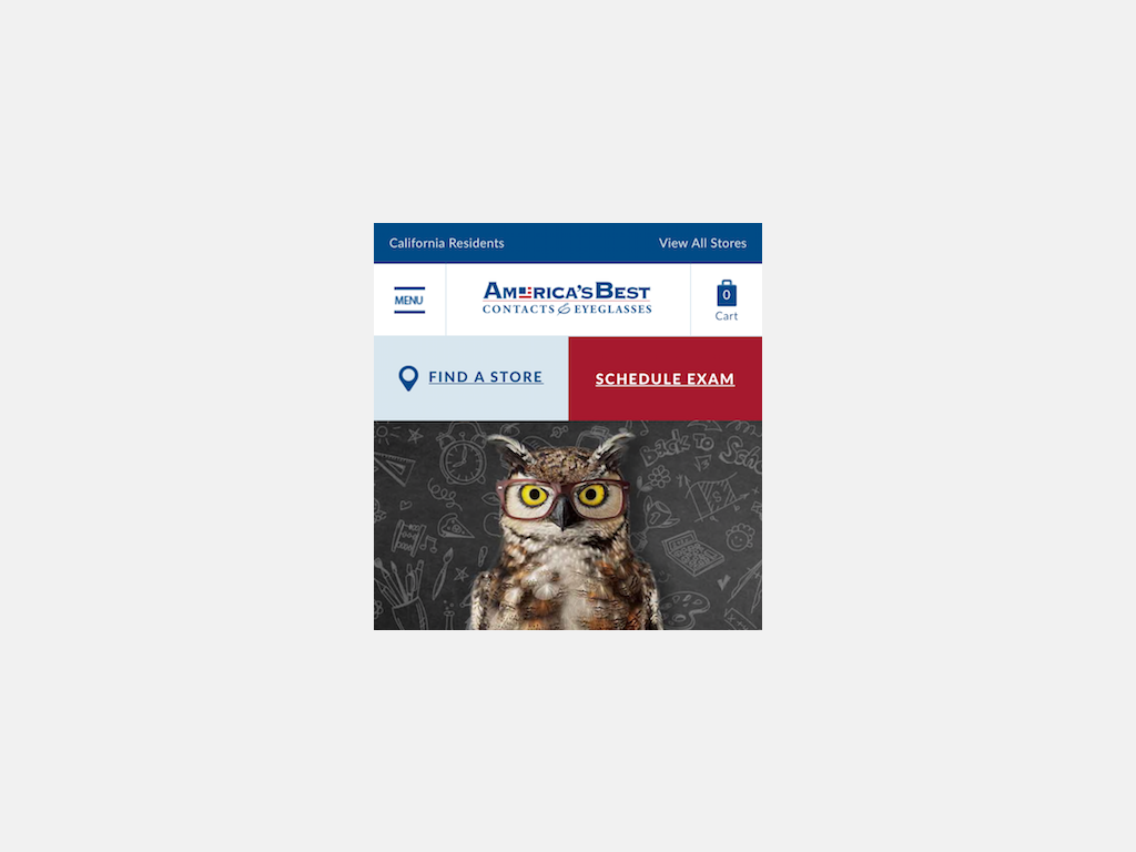
Header
We provided a few options for the header area to simplify the header and to have the header take up less space on every page, but the client had a lot of User information to support the ask.
Working with the visual design team, we created a newly designed header that contains the important features, but at an appropriate size / height for each page.
In Store Experience
The project team visited an in-person America’s Best store in order to see what the customer sees upon walking in and to understand the pricing levels and how they are displayed in-store. How designer eyeglasses are showcased. How a User is presented with lens coating and other options after selecting frames.
I also visited a store on my own and selected frames and lens options and ordered a pair of eyeglasses. I’m still wearing them today!
The new home page feels similar to the in-store experience in how areas of the site are positioned and how clean and simple the design is.

Old site home page

New site home page

Home Page: Mobile
Additional Page Designs
The rest of the site kept to a mostly standard layout and design. Additional features such as virtual try-on, prescription requirements, and selecting lens options made for a very fun project.

Product Listing Page from the site

Wireframe for the Product Listing Page

Product Detail Page from the site

Wireframe for the Product Detail Page

Mobile Wireframe – Product Detail Page
Result
The client was very pleased with how our designs reflected the data provided about the previous site usage – and also how the designs reflected customer expectations. Human Centered Design and Data Driven Design are critical design choices to help frame the problems and keep the design team centered on the right solutions to the problems.
In addition, the clients all were a joy to work with and the site turned out very visually stunning (kudos to the visual designers!).
Project Details:
Company: LiveAreaLabs
Year: 2016
Team Size: 5
My Role: UX Designer
My Contributions: Taxonomy, Wireframing, Prototyping, facilitating client review sessions.
Project Goal: Create a new look for 3 existing sites and move all 3 sites to a new CMS tool. Improve how lens options are selected.