Dashboard Redesign
The Second Step site is an important destination for learning about, shopping for, teaching from, and implementing Social-Emotional Learning programs offered by Committee for Children (CFC).
The My Dashboard page of the Second Step site is a launching place for authenticated Users to find all curriculum support materials in order to teach their students empathy, managing emotions, solving problems, dealing with peer pressure, bullying prevention, and more.
Previous version of My Dashboard page
Challenge
The old design of this page had some User experience opportunities.
The various elements that a User had access to were placed into separate panels.
If a User wanted to see items in a panel that wasn't open, they could open that new panel, but it would close the previously-opened panel.
The User could add access to other curriculum resources by adding another activation key, but that field was always open.
Many Users attempted to type their previously entered activation keys into that field, wasting their time and causing frustration with our site.
Approach
My approach was based on showing the User all of the items the User has access to at all times and not hiding any content behind a click.
If a User had a lot of resources unlocked, the User could close a section in order to focus their view on the content they want to see most often.
Room below important resources was included in order for our marketing team to include ad space for other resources and helpful products.
Wireframe I created in order to communicate the page layout. This is a User scenario that has both types of Middle School curriculum.
Wireframe I created in order to communicate the page layout. This is a User scenario that has access to a lot of curriculum packets.
I decided to take a fairly light lift in terms of moving content around. Our Users tend to not spend a lot of extra time on our site trying to find the relevant content...they need to find the material and start teaching.
I kept the structure of the current materials in place, but placed everything in already expanded sections to save the User from unnecessary clicks.
Most of our Users (a full 78%) only have access to one type of curriculum, so the typical dashboard would actually look much more simple and compact.
Results
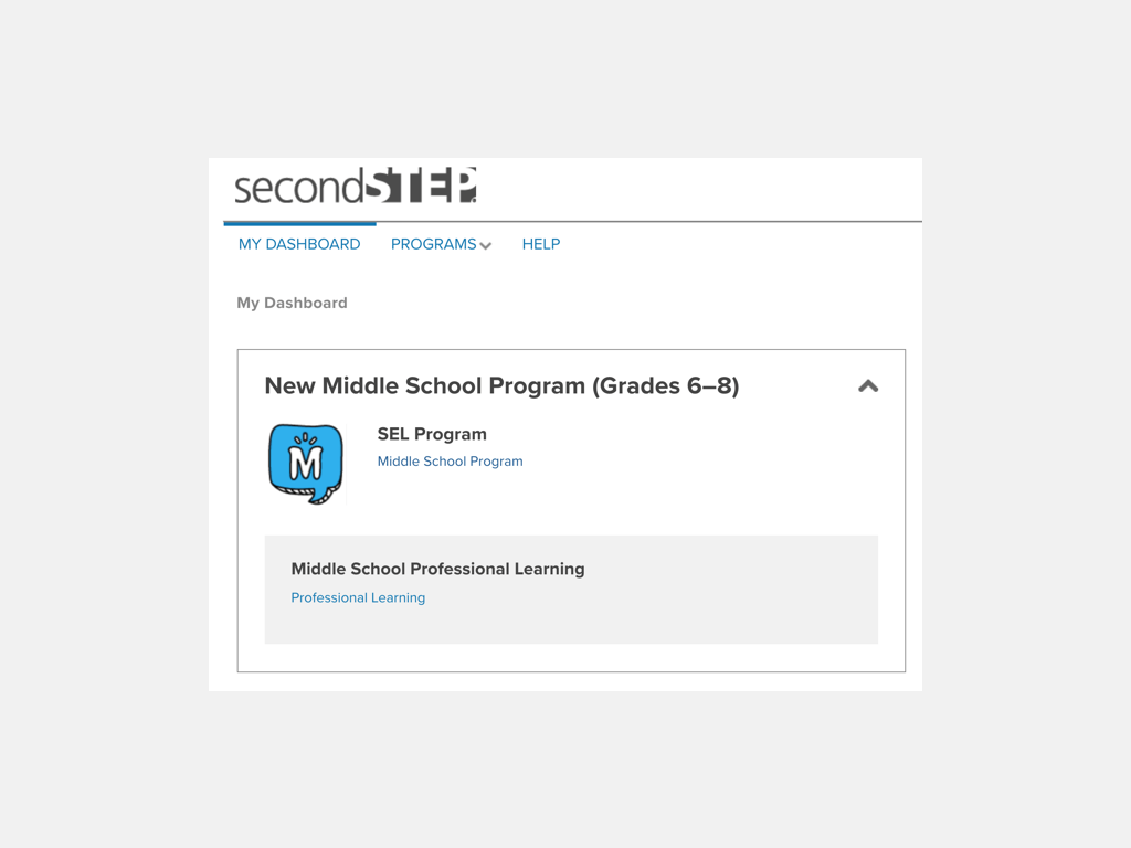
Final design of the My Dashboard page.
User data-driven design and reviewing the designs early on with customer-facing team members allowed us to deliver a simplified and updated visual experience for our Users.
Updated fonts and graphics and colors by the Visual Designer enhanced the experience and brought even more clarity to the project.
Project Details:
Company: Committee for Children
Year: 2017
Team Size: 4
My Role: UX Designer
My Contributions: Page & Section Layout and Organization, Wireframing, Prototyping, Stakeholder approval.
Project Goal: Update the My Dashboard page to accommodate additional curriculum links and take a new look at the way the page was laid out.


